Zero to Hero with Wireshark TCP Graphs: A Tutorial

In this tutorial I am going to make you a pro at using and leveraging the Wireshark TCP Graphing tools. As many of you who have taken my Wireshark Courses know, I am a big fan of visualizing what is going on in a given packet capture or conversation. My #2 troubleshooting step is to view the I/O Graph, for example (read more here).

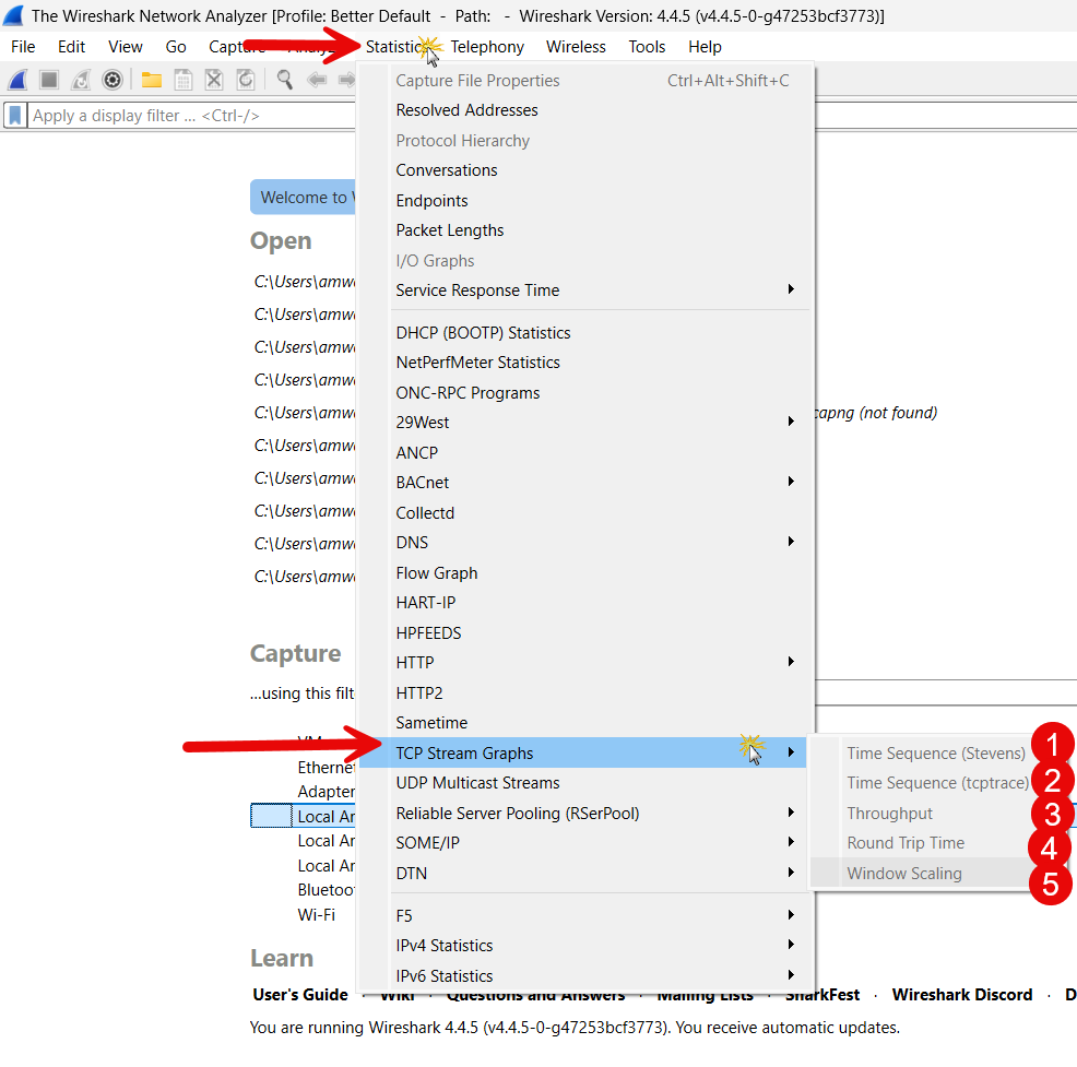
In all there are five different TCP Graphing tools available to us in Wireshark’s Statistics menu, as shown in the screenshot:

What we will do is look at each one of these. We will need packet captures that will show us what is going on, and allow you the reader to follow along seamlessly with this tutorial.

Starting Point

So to begin, you will need several things:

  1. Wireshark installed and running on your system (it can be Windows, Linux, or MAC OS)
  2. The Better Default profile that you can find here.
  3. The same capture/trace files that I used in composing this tutorial (see more next) You will want to download this ZIP file, save it in your Downloads directory, and then unzip it there. You should have the following .pcapng files:
    • TCP-Example1.pcapng
    • TCP-Example2.pcapng
    • TCP-Example3.pcapng

Now that we have all three things we need, so let’s get one thing straight right off the bat. All TCP connections are unicast, meaning one sender and one receiver. Technically, you could have large amounts of data going in both directions, but usually the Receiver is the one that requests something (like a web page, or a file), and the Sender then sends that requested item to the Receiver. These are TCP conversations. When using any of the TCP graphing tools in Wireshark, it is best to locate and use a display filter to filter the conversation you want to look at. Then, you have to have a packet selected that is part of that conversation in order for the graphs to work properly.

Viewing Our First TCP Graph

Let’s open the TCP-Example1.pcapng file in Wireshark. It should look like this:

As I always preach in class, your eyes should first look at the bottom tool bar. The filename is correct, there are 1246 packets in the capture, and we are using the Better Default profile. Excellent.

Now just for fun let’s look at Statistics> Conversations> the TCP tab: we see a single conversation in this capture/trace file:

The reason I had you do this step, is to remind you that you will be looking at an individual conversation, and right here is the best way to find that conversation, and then filter for it. Since this capture is just one conversation, we could have skipped this. So go ahead and close this pop up.

Back on the main Wireshark screen, select Statistics> TCP Stream Graphs> Time Sequence (Stevens):

You should get this pop-up:

Great!

The left vertical axis (y axis) is the sequence number of the packets in the conversation and the horizontal axis (x axis) is relative time in seconds. This is why this graph is called the Time/Sequence graph. Stevens graph is used in honor of W. Richard Stevens, a renowned computer scientist and author known for his seminal books on TCP/IP and UNIX programming.

Since the sequence number in a TCP packet is actually the number of bytes being transmitted, plotting sequence numbers over time reveals a connection’s throughput (think of it as bytes per second) in the direction from sender to receiver. In the view above, we see a reasonably stable data transfer based on TCP operation.

Let’s examine the various buttons on this pop-up.

On the right bottom, we see there is a Stream selector. In this capture, we only have one TCP conversation, so it has defaulted to “0”. We could have multiple TCP conversations in our capture, and to save time you can simply select the TCP stream you with to graph.

We also see a button to switch direction. The program defaults to the receiver who requests the connection. Let’s select this button to see the results:

This is the senders perspective. In this capture, the IP address 192.168.0.1 barely transmits any data. The sequence number basically sits at 127 and does not increase at all. This is a typical case of a transfer without bidirectional data transmission. Each of the dots then are the ACKs being sent back to the sender.

Now let’s look at the way the graphing interface works. On the bottom left we see a italicized set of information. This information will change based on where you hover your mouse. If you switch back to the prior direction and the hover your mouse over the first packet (dot) on the lower left, you should see this:

You will see the dot is circled next to the hand cursor. The italic text will tell you what packet is highlighted, followed by details as to the SEQ, ACK, and Window size. As you slide your cursor across the screen over these dots, that information is updated.

Below this is a Type field, that allows you to switch the different types of TCP graphs supported in Wireshark. We will stay with Stevens for now.

Lastly in this area is the radial buttons that allow you to change what the mouse does when you left click and hold. The default is drags. But you can change that to zooms if you prefer. If you leave it as drags, the mouse wheel will zoom in and out. You may want to change these settings depending on whether you have a stand alone mouse of you use a touch pad. Any change to this setting is written to whatever profile you have open.

The Time/Sequence (Stevens) TCP Graph in Wireshark provides a visual representation of TCP sequence number versus time, helping you analyze the flow of TCP segments between two endpoints. It’s named after W. Richard Stevens, author of TCP/IP Illustrated, and it mirrors the classic style of TCP flow analysis used in his books.

The graph is displayed as follows:

  • X-axis: Time (seconds) relative to the beginning of the capture or the first TCP segment.
  • Y-axis: TCP sequence number (raw byte sequence space).
  • Each point: Represents a TCP segment, plotted at the time it was observed and showing the starting sequence number.
  • Vertical length of a point (line): Indicates the number of bytes in the TCP segment (i.e., the length of the payload).

Color is used as follows:

  • Blue/Black lines: Normal data segments.
  • Green or Red marks: Retransmissions or duplicate ACKs (depending on the Wireshark version).

With that said lets explore. Zoom in on the first couple of clusters of dots (you will combine zooming and moving):

We see it starts with one data packet, then some time and a second, then we see 2, then in the next cluster we see 4, then the next cluster we see 8, then 16, etc. This is the doubling of the Receiver Window that is in TCP’s congestion control algorithm. If you look at calculated window sizes, they keep getting larger as time moves forward. This means the speed is increasing as more frames are sent in less time. You see these little exponential curves until linear growth and flow control levels out the increase rate.

Moving on to The tcptrace Graph

OK – lets change the type to Time/Sequence (tcptrace) graph:

The result of the change should look like this:

Like before with the more simple TCP Stevens graph, the TCP sequence numbers are represented over time. In the TCP graph, you see this as a blue line. Zooming in, it turns out that the blue line is composed of many small vertical lines. These are the individual TCP segments:

The blue line length indicates how many bytes are carried within one packet. In our pcapng file these are primarily full size packets (most will look like this). You may encounter some captures that have smaller packets interspersed with large packets. This happens often in transfers that are interactive.

The yellow/gold line is the ACK line. This like should keep up with the blue line, unless there are duplicate ACK’s meaning data may have been lost.

If you zoom out, you will see there is also a green line in this graph:

The green line marks the upper edge of the receiver’s advertised window. It shows the maximum sequence number the sender is allowed to transmit, based on the receiver’s current buffer availability.

  • If the data (blue dots or black lines) approaches or hugs the green line, the sender is window-limited.
  • If the data points stay well below the green line (as in our example), the sender has room to transmit more — it may be congestion-limited or application-limited.
  • A flat green line may indicate the receiver is not increasing its window, possibly due to buffer exhaustion or poor tuning.

But what happens when there are problems?

Hopefully you now have a solid base of understanding of what these graphing functions are showing. Everything we have see so far is when a TCP conversation is good, and there are no issues.

Let’s look at a couple of examples where there were issues, and these graphing functions help us to visualize and locate problems.

If you load up the TCP-Example2.pcapng into Wireshark, and look at the tcptrace graph, you will see this:

Right off the bat, you can tell that this does not look normal.

The green line is way above the others, so we know this is not an issue.

Let’s zoom into that timeframe between 0.6 and 0.8 seconds:

They are hard to see, but the hash marks on the gold line or ACK line are Duplicate ACK’s or DUP ACKs. DUP ACKs can be recognized in the TCP trace graph because the ACK line does not increase, and small hash marks below the line are visible. DUP ACKs are used in packet loss to trigger fast retransmissions. Too many DUP ACKs can be an indication of too many packet losses:

You will also see in this example that the blue lines seems out of order, because they are:

Above, the sequence numbers (remember by hovering on a blue segment, you get the info in italics). We can clearly see that SEQ 14771 came after and out of order from the three other packets noted.

Further we see red lines. A red vertical line at a specific sequence number and time indicates that the same data (same sequence number) has been sent again — i.e., the segment is a retransmission. This can be due to:

  • Packet loss
  • Duplicate ACKs
  • Timeouts or congestion-related retransmissions

Multiple red lines at the same sequence number means repeated retransmissions — suggests severe loss or congestion. Red lines shortly after black lines means fast retransmissions (often triggered by 3 duplicate ACKs). Scattered red lines might indicate random losses on the path. Clusters of red lines suggest a burst of packet loss or a poor-quality connection.

In any case, Red is bad!

OK – let’s load up TCP-Example3.pcapng, and open the tcptrace graph:

Clearly not normal. The first thing that sticks out is that the green line and the blue lines are on top of each other the entire time. Remember what we said earlier – if the data (blue dots or black lines) approaches or hugs the green line, the sender is window-limited. That is definitely what is going on here. So I would be wanting to study the window sizes or window scaling.

Further, I see (when you zoom in around 30 seconds, all the red lines – so there are retransmissions, and I would want to look at those packet sequences.

I think this last little exercise shows you the purpose of these graphs in the statistics menu of Wireshark. It is about visualizing – quickly determining what looks good vs. bad and then locating within the capture where issues may be.

Symptoms of SACK Issues in TCPTrace Graph:

In Wireshark’s TCPTrace Graph, SACK-related issues are not always directly visualized with explicit SACK flags, but you can infer problems by observing certain patterns in retransmissions and ACK behavior. For example:

  1. Multiple Red Lines (Retransmissions) for the Same Sequence Ranges:
    • If SACK is disabled or ignored, TCP may retransmit more data than necessary.
    • Look for redundant retransmissions (red lines) that would have been avoided with SACK.
  2. Large Bursts of Retransmissions Instead of Selective Ones:
    • TCP without SACK tends to retransmit entire windows instead of just missing segments.
    • The graph will show large drops in sequence number followed by a staircase-like retransmission pattern.
  3. Slow Recovery Slope After Loss:
    • Without SACK, recovery from loss is slower, as TCP must wait for cumulative ACKs.
    • The sequence number progression (black/blue line) flattens for a while, then ramps up slowly.
  4. Delayed Sequence Number Advance After Loss:
    • A flat line in the graph indicates the sender is not progressing—possibly waiting for an ACK due to non-SACK recovery.
    • SACK would allow more efficient progress.

While the TCPTrace graph itself doesn’t explicitly show SACK blocks, you can confirm their use:

  1. Check TCP Options in the packet details:
    • Look for TCP Option – SACK Permitted in the SYN/SYN-ACK handshake.
    • Look for TCP Option – SACK in ACK packets (with actual SACK blocks).
  2. Use a Wireshark display filter:
    • To see if SACK is being used: pgsqlCopyEdittcp.options.sack
    • To see if it’s permitted: pgsqlCopyEdittcp.options.sack_perm

SACK issues in the TCPTrace graph manifest as inefficient retransmissions, slow recovery, and excess red lines. If you see a lot of unnecessary retransmissions, suspect that SACK may be disabled, misconfigured, or not supported by one of the endpoints. For deeper analysis, correlate the graph with packet-level SACK behavior using Wireshark filters and packet inspection.

I hope this helps you in your use of Wireshark. Did I miss something? Would love to hear from my readers.


Comments are welcomed below from registered users.  You can also leave comments at our Discord server

If you would like to see more content and articles like this, please support us by clicking the patron link where you will receive free bonus access to courses and more, or simply buying us a cup of coffee!

Scroll to Top